10 things that helped us with acquiring more customers.
10 low hanging, low-effort, fast to ship, easy to measure hacks/tactics/move.
I’m a growth hacker and a GTM engineer, and on any given day, I’m juggling a ton of roles: part marketer, part data analyst, part automation engineer, and part product strategist to drive user acquisition, optimize conversion funnels, automate marketing workflows, analyze user behavior, and run growth experiments.
Which means, I (we) do anything and everything necessary to achieve growth.
But you don’t need to do everything to get moving. If you’re pre-5k users, your edge is speed: ship small, high-leverage changes that reduce friction and make the value obvious.
The hacks (not exactly hacks but moves or tactics) below are exactly that: low-effort and high-impact, designed to be quick to implement, quick to learn from, and meaningfully move sign-ups.
Each hack includes why it works, what we actually did, how to ship it fast, what to measure, and (if there are any) pitfalls to avoid.
1) Remove unnecessary form fields
💡
Every extra field adds friction and drop-off.
Keeping only essentials reduces cognitive load and completion time, so more people finish signup.
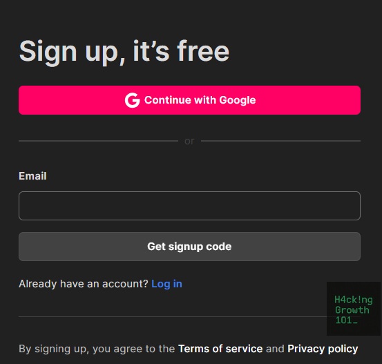
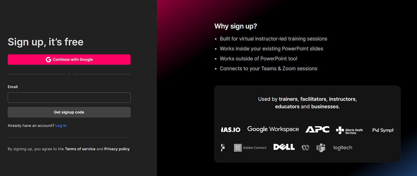
We trimmed our signup to just email and a “get signup code” as a button (or Signup with Google option). Company, role, phone, etc., were entirely removed. We can easily get these data points from Apollo anyway.
Delete all non-essential inputs.
Move nice-to-have fields to an in-app profile step.
If you truly need firmographics, enrich via a third-party like Apollo later.
Measure and compare signup conversion on the signup step and time-to-complete.
2) Add elite social proof
💡
Prospects borrow confidence from people/brands they respect.
Logos and outcomes near the CTA create an aspirational “people like me use this” effect.
We picked 3–6 credible customer logos and a short outcome blurb for each (specific result beats flattery) and placed them everywhere a CTA exists.
Gather permissioned logos + 1-sentence outcome.
Place right next to the form (desktop + mobile).
Measure the signup form CTR and page-to-signup conversion.
Remember to avoid “logo cemeteries” detached from a concrete result. Also, stale or unknown brands can signal the opposite of what you want.
3) Make your copy transformative
💡
Specific, outcome-oriented copy clarifies value.
Users act when they see a clear before → after transformation (ideally with a number).
We rewrote our headline + first sentence to spotlight the transformation, made the value prop unmistakable, and added one metric that proves it.
Headline: “Go from X to Y in Z minutes.”
Subhead: the 1-line “how”.
CTA: action + outcome (e.g., “Start analyzing calls”, “Engage your live audience”).
A/B test headline + CTA for one week.
Measure fold CTR, page→signup conversion, and CTA clicks.
Don’t put vague benefits, jargon, or claim outcomes you can’t deliver.
P.S.: According to this model, we created our headline, “9x your audience engagement in your next live training session.” This number was reached based on a user survey and looking at our own data. Although right now you’ll see some other headline, of course, because we are always testing a new variation.
Check here: www.streamalive.com
4) Add SSO login options (Google/Microsoft/GitHub)
💡
One-click signup removes password friction, especially for work tools where users are already authenticated.
We added Google SSO first (most of our ICP), then Microsoft (still in progress). We kept email/password as a fallback.
Start with the Identity providers (like google, microsoft, github, etc) your audience uses most.
Put SSO buttons first, email/password second.
Track share of SSO vs. email/password signups.
Measure SSO adoption rate and overall conversion on the signup step.
Remember, Broken SSO redirect loops on mobile, so verify error states before launch.
If you didn’t know, SSO means single-sign-on.
5) Ditch “signups” as the headline metric
💡
Optimizing for raw signups breeds vanity growth.
Optimizing for qualified signups focuses your team on traffic that matches your ideal profile and activates better.
Earlier, we used to put signup conversion rate at the pedestal, but now we have shifted our main metric to activation rate, and we always check for changes in activation rate whenever we make any changes to any copy or design. Even the constantly running homepage headline multivariate test has its metric set to activation.
Define what is your activation metric. For us, it is a user using StreamAlive successfully (can’t reveal here how that’s defined 🤫) in their Zoom, Ms teams, G Meet, YouTube, or any other session.
For-go the signup as your main metric metric and only check if the changes that you made to copy, design, or tech made an impact on the number of activated users, not only on the signed-up users.
Report weekly on the Activation rate.
Measure % of signups that match ICP, and their activation.
Long surveys; free-text fields that slow users down, so figure out for yourself if the user is qualified (and activated).
Don’t ask the user, observe the user.
6) Optimize your top 10 traffic-driving pages
💡
Search engines and humans reward fresh, relevant pages. Small updates can unlock visibility and compounding signup gains.
We pulled our top 10 entry pages and refreshed examples, meta descriptions, and visuals (screens, diagrams, or 30-sec video). CTAs were rewritten for clarity and intent.
From analytics, list the 10 pages sending the most traffic.
For each: update one example, one visual, one CTA.
Ensure a single primary action per page.
Measure page-to-signup conversion by page and organic CTR if you updated the meta.
Don’t change URLs.
7) Create a high-value exit-intent offer
💡
Exit-intent gives abandoning visitors one last reason to stay in touch, trading real value (template, checklist, mini-course) for permission to continue the conversation.
Note: (still in progress)
We built one no-fluff asset relevant to our ICP and triggered a polite, skippable modal only on high-intent pages (pricing, feature, comparison). For us, it will be PowerPoint templates for corporate trainers and facilitators.
Here are some tools you can use to create exit intent pop-ups.
Wisepops — Best for online stores
Picreel — Best for visitor surveys
Rivo — Simple exit popups for new businesses
Sumo — Free exit popup tool
Optinmonster — Made for WordPress
Things to consider:
Make a single high-value asset (e.g., PowerPoint templates for corporate trainers and facilitators).
Fire the modal on exit, not on entry; capture their email.
Make sure you don’t show the modal to already logged-in users.
Nurture with 2–3 emails leading back to signup.
Measure captured emails, their later signup rate, and activation.
Remember, Aggressive popups hurt UX. Also, please don’t give irrelevant bribes that don’t match your product value.
8) Get crystal-clear on your ideal user
💡
If the team isn’t aligned on who you serve (goals, pains, endgame), you’ll ship generic onboarding and generic marketing, and nothing will resonate.
After almost 1.5 years of looking at our most active users and monetised users, we finalised who StreamAlive is best suited for. And we decided to put all our efforts into only the ICP. It is not to say that we won’t support anyone else, but our all paid efforts and outbound marketing are only targeted towards that ICP.
You know which ICP we are talking about.
And now our whole org is aware of that fact. Marketing knows who they are writing content for, design knows who they are designing for, and the devs know who they are building for.
Look at 2 data points. Who is most active and who is paying. Then decide on the ICP.
Document what the ICP wants to achieve or what “success” looks like for them.
Update homepage, onboarding, and emails to speak to that user.
Measure qualified signup rate and first-session completion of the key action.
Don’t decide personas without looking at data and observing your customers. Too many ICPs will lead to chaos, so avoid that.
9) Deploy the Promised Land effect on the signup screen
💡
Seeing the “ideal outcome” makes the next click feel inevitable. A blurred or teaser view behind the form turns vague promise into tangible anticipation.
The “aha” state of StreamALive is a bustling live session with attendees pouring in comments. So we created a sandbox of that with AI pouring in the comments and embedded the sandbox on almost all pages of the website. This gives users a look at how their live session will get transformed once they start using StreamAlive.
If you can create a logging-less sandbox, then do so; else capture your best “after” moment, and blur it.
Place behind/adjacent to the signup form with a crisp CTA.
Remove secondary CTAs on that page. → for us, the CTA is a Duplicate Template, which is a single click signup button duplicating the template, all-in-one click.
Measure page-to-signup conversion on each page where you have added the promise land.
Don’t over-blur to the point of confusion. And also, don’t show features that the user won’t reach quickly.
10) Optimize your golden pages (homepage, pricing, signup, in-app billing)
💡
These are the money pages, where users make critical decisions. Small improvements here have outsized effects on acquisition.
We audited each page for clarity (headline/value), CTA prominence, speed, and path friction; used analytics/session-replay to spot bottlenecks; and A/B-tested headlines/layouts. (We still do it every month)
For each golden page, ask:
Is the value instantly clear?
Is the CTA unmistakable?
Is it fast and seamless?
Triage changes per page and test.
Measure page-to-signup conversion on all pages where you made clarity changes.
Don’t test too many elements at once, and most importantly, don’t neglect mobile.
That’s it… at least for today.
Don’t wait for a full redesign or a quarter-long project. Choose one tactic your funnel obviously needs (form friction? unclear value? no SSO? thin proof?) and ship the smallest viable version as soon as possible.
When it comes to Hacking Growth, getting it done is more important than getting it perfect.
These are deliberately scoped to be low risk, high payoff, short time to value. That’s how we stacked early wins and built momentum.
See you next week, with what helped our Activation or Monetisation.


Super helpful insights! Great read Rishikesh 😊